Showing posts with label OPI comparison. Show all posts

Sunday, 8 February 2015

OPI Hawaii Spring/Summer 2015 Collection Swatches & Review

This years OPI spring/summer collection had a lot to live up to. I was in love with the Brazil collection and it's actually the first and only collection where I own all of the nail polishes! Well.... the Hawaii collection did not disappoint! Apart from one nail polish, but we'll get to that later! This post will cover swatches, a quick review and a comparison! 

I picked up 7 of the 12 colours. I'll start off with the nude of the collection: Do You Take Lei Away. I'm a sucker for nudes so there was no doubt in my mind to get this one. It's just the right kind of nude for my skin tone, very light and slightly pink toned. 

The formula was very easy to work with and I only needed 2 coats for the swatch. I didn't use a top coat. 


I compared it to three other OPI colours: My Very First Knockwurst, Pretzel My Buttons and Don't Bossa Nova Me Around. Knockwurst is definitely more pink, and Bossa Nova is way lighter. Don't Pretzel My Buttons is very similar, and most people probably won't be able to see a difference. It's slightly less pink toned and a tint lighter than Do You Take Lei Away. 

The next colour is this amazing pistachio green called That's Hula-rious. Although a lot of people call it a mint, I think it's much more of a warm toned pastel green. 

The formula is incredible! It's super opaque and easy to work with. I used 2 coats for the swatch and no top coat. 


The first colour I thought of was Gargantuan Green Grape. I don't have it to compare but I did own it about a year ago... swatched it on all of 2 fingers. I found the formula of GGG so watery and sheer! I hated it so immediately got rid of it. 

I do have some other colours to compare it to Essie Mint Candy Apple and Kester Black Bubblegum. Both colours are much more of a true mint as they contain a lot more blue. 

Another perfect spring colour is Suzi Shops and Island Hops. A gorgeous bright pastel pink. 

I used 2 coats for the swatch and no top coat. Again amazing easy formula. 


Well... this is a little disappointing...  Suzi Shops and Island Hops is a 99% exact dupe of Pink Friday from the Nicki Minaj Collection. One of my all time favourite pinks is Pink Friday so if you missed out on that one, definitely get this one. You don't need both. 

I'm obsessed with this next one. This is Aloha from OPI and it's this stunning super bright coral. 
2 easy coats and no top coat. I'm currently wearing this on my toes! 


I thought this was going to be identical to Live.Love.Carnival from last years Brazil collection... I couldn't be more wrong! Live.Love.Carnival is much more pink toned and not nearly as bright. 

Red Lights Ahead...Where? From the Holland collection is very similar, but it's more of a true red, whereas Aloha from OPI is more coral toned. 

The darkest shade in the collection is Hello Hawaii Ya? This is a very dusty grey toned purple. 

This could easily be a 1 coater, but for the sake of consistency I used 2. No topcoat. 


I thought this was going to be very similar to Planks A Lot from the Pirates of the Caribbean collection... it's not! Planks A Lot is much lighter and slightly warmer toned. Kester Black French Lavender is also much lighter. 

This colour has been named the grandma colour that everyone actually really likes. This is Just Lanai-ing Around. It's another darker dusty colour from those who don't like spring pastels. It's a rosy toned pink. In the bottle you can see some silver shimmer, but they didn't show up on my nails whatsoever. 

Again, amazing formula. You could easily get away with just 1 coat, but for consistency I used 2. No Topcoat.


The only colour I thought that would be similar was Kester Black Peony, but that's much lighter. 

The final colour I purchased is This Color's Making Waves. This is a beautiful blue shimmer polish with very very subtle shimmery coppery specks. They are very difficult to see, however sometimes if the light hits it right, you'll see a very warm glow. 

I used 2 coats no top coat. 


I compared it to Barry M Pacific... they're pretty much identical. Pacific doesn't have the coppery specks, but let's be real... you can't really see those anyway! 

That's everything I picked up from the OPI Hawaii collection! There are 5 more colours, an orange (identical to Where Did Suzi's Man-Go), a red with golden shimmer, a bright shimmery green, a bright blurple (similar to Eurso Euro and Do You Have This Color In Stock-holm), and a really really really horrible golden metallic with multicoloured glitter. Ew. 

Have you picked up any of the OPI Hawaii collection? What did you think of the collection, does it compare to last years Brazil collection? 

xx Elaine 

Wednesday, 31 December 2014

OPI 50 Shades Of Grey Collection Swatches & Comparison

I recently picked up 4 of the new 50 Shades Of Grey collection by OPI. The collection consists of 6 colours: 2 greys, 1 red, 1 almost black grey, a silver, and a dense silver and blue glitter.

I picked up Romantically Involved (red), Cement The Deal (light grey), Embrace The Gray (darker grey) and Dark Side Of The Mood (almost black grey).

They are all creme finishes. Dark Side Of The Mood need 2-3 coats and the others all just need 1-2 coats.

I'll start off with my favourite, Romantically Involved. OPI has been coming out with so many reds, especially with the recent Christmas collection! As soon as I saw it though I knew I wanted it. It's a much deeper red with hints of burgundy. Below I have compared it to two other reds where you can really see the colour.

I used 2 coats for the swatch with topcoat, and no top coat on my thumb. If you're careful you only need 1 coat. It does dry super glossy on its own, but I added top coat to all the polishes so wanted to stay consistent.


The second colour is Embrace The Gray, this is the darker of the 2 greys. Again the formula was great and you could easily get away with just one coat. For consistency, I used 2 coats and top coat and no topcoat on my thumb.

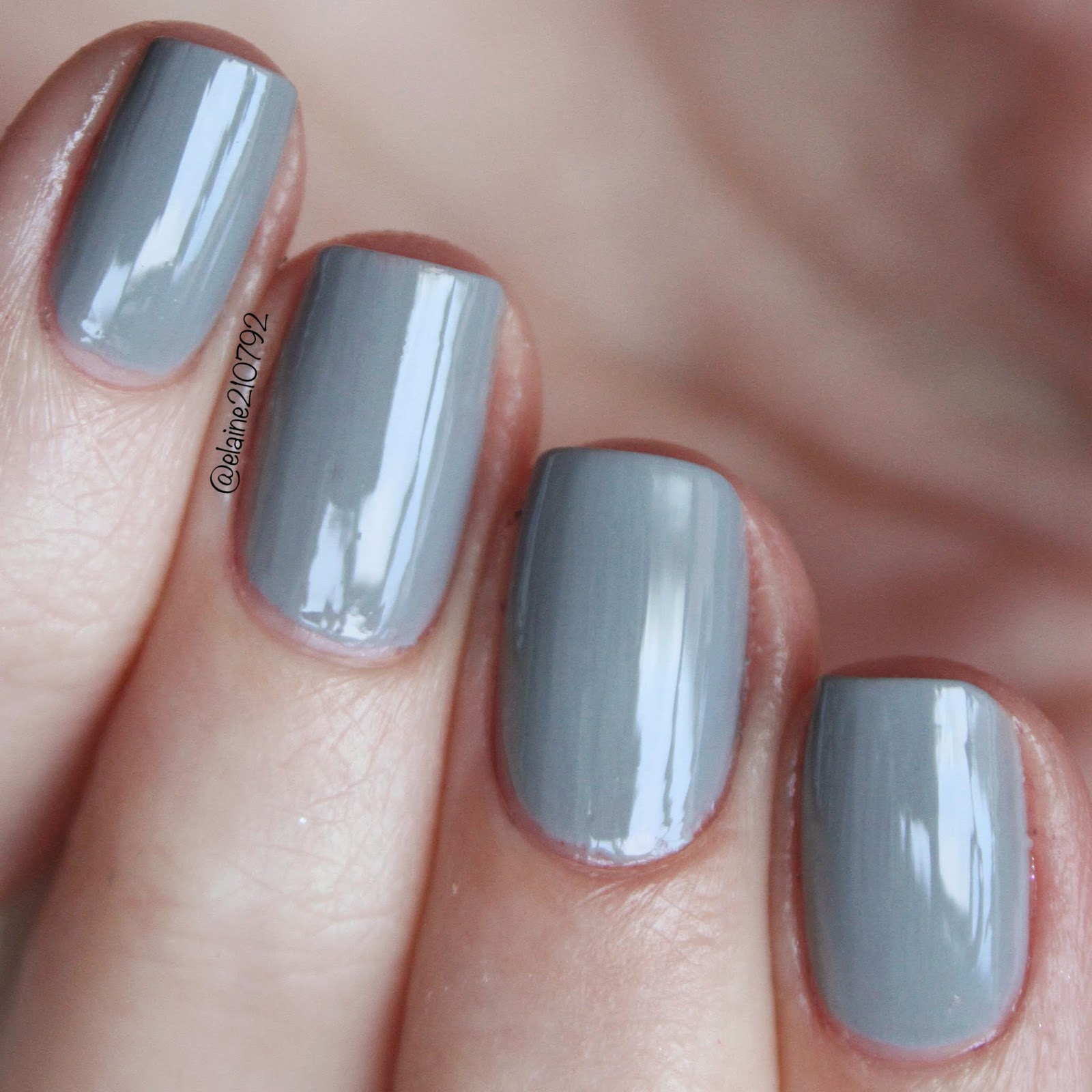
The two greys lean quite blue which makes them both really unique. There aren't many greys out there!


The next polish is Cement The Deal, the lighter of the greys. I am literally in love with this one and it's my second favourite from the collection. It's much lighter and looks much more flattering on my pale skin tone.

Again I used two coats and top coat, and no top coat on my thumb. Really easy formula and it could easily be a 1 coater.

This is again quite blue toned, but not quite as blue toned as Carey by Zoya. (comparison below).


Last up is Dark Side Of The Mood. I used two coats and topcoat for this swatch, again no top coat on my thumb. It was definitely a lot more sheer than the previous three polishes and needed the second coat. I have read a lot of reviews saying that they needed three coats.

It's a very dark almost black grey with a very subtle shimmer you can kind of see on the nail if you really look for it.

I think it's a really beautiful colour, especially if you don't feel comfortable going full on black. For me, I have to be in a certain mood to wear these types of colours, they definitely aren't for everyday!


What do you think of this collection? Will you be picking up any of the shades? 

Sunday, 3 August 2014

OPI Nordic Collection Swatches and Comparisons

The new Autumn 2014 collection by OPI is the Nordic Collection. It consists of 12 new polishes including 1 glitter, 2 shimmer and the rest are all cremes.  I picked up the mini set which includes My Dogsled Is A Hybrid, Do You Have This Color In Stock-holm?, My Voice Is A Little Norse, How Great Is Your Dane?

The collection will be released on the 6th of August, although I purchased this set from Nail Polish Direct early.

First up is My Dogsled is a Hybrid, a bright sea foam green creme formula. It's a really nice bright pop of colour for the autumn, without being too in your face.

I used 2-3 coats for the swatch, some of my nails only needed 2 coats, whereas other needed a third coat to even out any streakiness.

When I saw the colour I immediately thought of OPI Thanks a Windmillion and Barry M Greenberry. I have MDIAH on my middle finger and pinky, Barry M Greenberry on my index finger and OPI Thanks A Windmillion on my ring finger. They're not close at all! Greenberry is much brighter and more blue toned, whereas Thanks A Windmillion is much more muted and green toned. My Dogsled Is A Hybrid is right in the middle of the two.

I also swatched My Dogsled Is A Hybrid alongside Kester Black Alimony. Alimony has a similar brightness, but is MDIAH bluer sister.

Next up is Do You Have This Color In Stock-holm. That's such a great name! And also such a great colour! Opi describes this to be an icy blue violet. It's a very bright, dark, blue toned purple.. if that makes sense?

I again used 2-3 coats for the swatch. The first coat seemed very sheer and a bit jelly-like, but the second coat covered it up beautifully. I did have an issue with a bald spot (probably not letting it dry) so I did apply a third coat on one nail. I think with the wider OPI brushes the application would be easier.

I know I don't have anything like this in my collection, but I just wanted to compare it with a few other purples that I love. I have DYHTCIS (that's long!) on my index and ring finger. I used Kester Black Deep Violet on my middle finger and Ulta3 Spring Break on my pinky. Kester Black Deep Violet is a much darker and warmer purple. Spring Break has a similar brightness, but is much more pink toned.

The third nail polish is My Voice Is A Little Norse, a holographic glitter. I love holographic nail polishes so was excited to try this one out! On my index finger I applied one coat over DYHTCIS, and on my ring finger I applied one coat over MDIAH. On my middle finger and pinky I applied 4 coats.

I think the glitter works better as a topper than on its own as you can still see my nail line underneath. The holo effect also works better over the purple than any other nail as you can see in the blurred shot.

It does have a beautiful holographic shimmer, these photos are taken in the shade.

I compared this to Kester Black Milkyway. You can immediately notice a difference in the two bottles. Milkyway is a lighter silver holographic glitter, whereas MVIALN is slightly darker and less holographic. I used one coat of MVIALN over Do You Have This Color In Stock-holm and  4 coats on its own on my middle finger. I again applied one coat of Milkyway over Do You Have This Color In Stock-holm on my ring finger and 3 coats of Milkyway on my pinky. Milkyway is more of a dense glitter as 3 coats equal to 4 coats of MVIALN. This photos are taken in the shade.


The final colour is How Great Is Your Dane? It's a dark brown 'cinnamon coffee' shade. During the Autumn in Australia I really started to get into darker brown shades like this one so I think this'll be another great colour this season. This had the easiest application out of the cremes and I only used 2 easy coats.

I compared it to OPI I Sao Paulo Over There from the Brazil Collection and OPI I Brake For Manicures. They're all very different. ISPOT is on my index finger, HGIYD is on my middle finger and pinky and IBFM is on my ring finger. ISPOT is much lighter and cooler toned, whereas IBFM is much darker and slightly more purple toned.


What do you think of the new Nordic Collection? Will you be picking up the minis or going straight to the full sized bottles?
xx Elaine

Saturday, 5 April 2014

OPI I Love Applause

First up from my eBay OPI haul is I Love Applause. I was a little apprehensive about this colour since it is a sheer formula, and I looove my cremes. This colour is from the new Muppets Most Wanted collection. It consists of eight polishes: 3 glitters, 3 sheer polishes and 2 metallics. I honestly wasn't too thrilled with the collection, I have a love hate relationship with metallic and glitter polishes and never liked sheer ones! Anyway, I loved this colour so thought I'd just give it a go. I saw a lot of swatches where people used 3 coats and it was completely opaque.

Well… I LOVE it. When I applied the first coat, I got super worried. It was incredibly sheer and a little streaky. How could this possible become opaque in 3 coats?!? The second coat made a huge difference and finally the third coat made it perfect. It's such a beautiful elegant light pink shade. You can slightly see my nail line, but I think that actually adds to the polish. This literally opens up a whole new world of nail polish…. uh oh….

Don't Bossa Nova Me Around, I Love Applause, My Very First Knockwurst
I do have a few other light pink shades so I thought I'd do a quick comparison. First up is Bossa Nova Me Around, from the new Brazil collection and My Very First Knockwurst from the Germany collection. First off, I Love Applause is a sheer nail polish whereas the other two are creme finishes. Secondly I would classify I Love Applause as a pink, but the other two nude pinks. Don't Bossa Nova Me Around is a lot more creme coloured, definitely more nude. My Very First Knockwurst is the same shade of pink, but the creme finish makes a huge difference on the overall look of the nail polish.

Pink Friday, I Love Applause
This second comparison is with Pink Friday from the Nicki Minaj Collection. Again, Pink Friday is a creme finish so a lot more opaque. It's also a much darker barbie bubblegum type of pink and a lot brighter.

Click to Enlarge
The photo shows the four nail polishes on my nails. Sorry for the slightly messy application, it's on my right hand (I'm right handed) and I wasn't very patient. I used three coats for Pink Friday  (normally you can get away with just two but using my non dominant hand is pretty difficult) and I Love Applause. Two coats for My Very First Knockwurst and Don't Bossa Nova Me Around. As you can see, DBNMA is the closest match, but still very very different.